Self-initiated concept
B2B Brand Operating System
Context
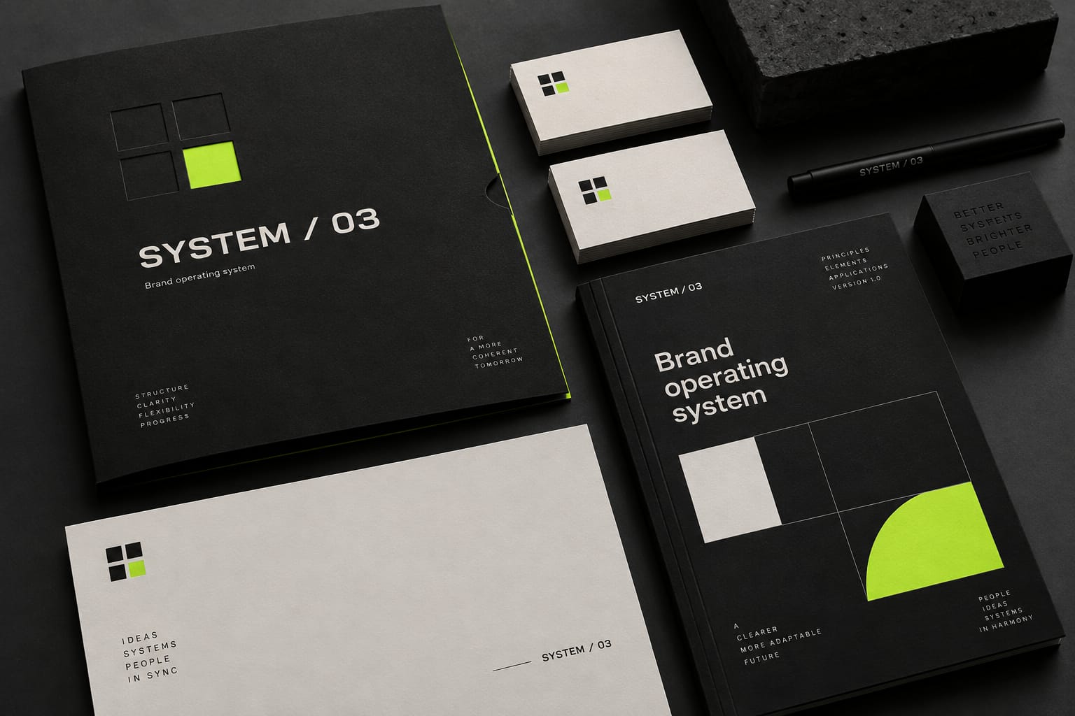
A conceptual visual world for a B2B brand that needs to appear coherent across every high-value customer interaction.
This is a self-initiated concept, not client work. It does not represent a commissioned project or measured result.
Strategic approach
- 01
Connect positioning, identity, and practical marketing applications.
- 02
Create clear rules without making the system feel rigid.
- 03
Prioritize recognition, trust, and ease of use for internal teams.
A closer look
One language.
Every touchpoint.
AI-generated concept imagery. A visual direction demonstration, not a commissioned client project.
The system, broken down
Colour, type,
and form.
Palette sampled from the AI-generated concept imagery. Application sketches are drawn in code to show how the direction could extend. They are not delivered artwork.
One sans family / mono labels
Clarity at every touchpoint
One sans family across every format, with weight and size doing the work instead of extra typefaces.
LABEL / 0.7REM / MONOSPACED
Recurring form
A four-square symbol, with one square turned into a quarter circle, repeats as a grid across stationery, guidelines and campaigns.
Project at a glance
The brief behind
the direction.
B2B marketing teams seeking a coherent visual direction across multiple brand touchpoints.
- Project type
- Original illustrative concept, not commissioned work
- Role and authorship
- Self-initiated concept created for this portfolio with AI-generated imagery. No client engagement or personal delivery credit is claimed.
- Scope explored
- Conceptual brand world
- Material and color direction
- Visual system principles
- Application planning
- Production status
- Visual exploration. Not a delivered identity or production-ready artwork package.
Design rationale
Connected, not identical
One modular symbol, a black and ivory base and a single lime accent explore how a brand can feel coherent without making every application look the same.
Translate the idea into rules
The next stage would define the typography, color roles, image direction, and application examples needed to turn this exploration into a working identity.
Evaluation, not invented results
What would need
to be proven?
No client outcomes have been measured for this concept. A real project would validate the following before claims are made.
- Evaluate the direction against a confirmed positioning brief.
- Test representative sales and marketing applications.
- Review whether internal teams can apply the rules consistently.