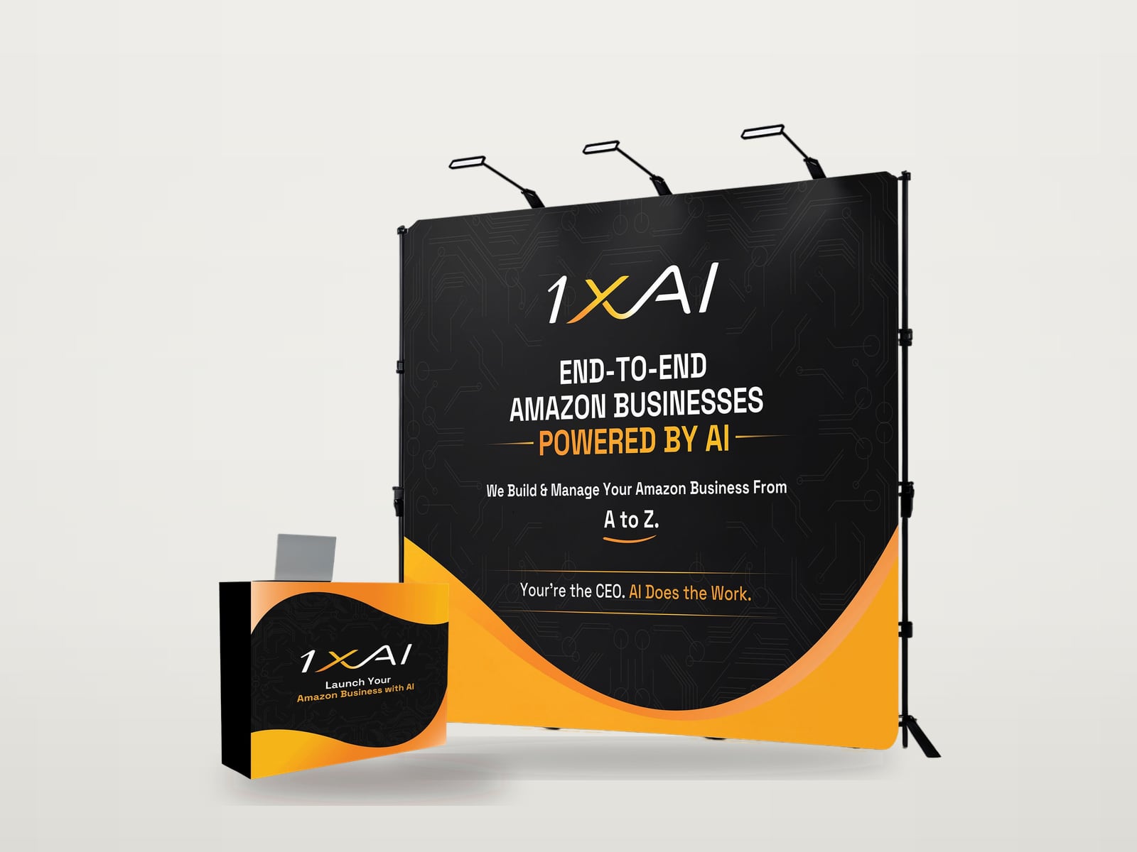
1. Your logo, high up
Put the logo near the top, where it can be seen over people and the counter. Visitors look up when they scan an aisle, and people standing in front of the wall hide the bottom third.
2. One short headline
The headline says what you do for the visitor, in plain words. Aim for under eight words. Real examples from the work: "End-to-end Amazon businesses powered by AI" on the 1XAI backdrop, and "From the shop floor to the top floor" on the AdCirrus ERP backdrop.
Make it the largest text on the wall. A common sign-making rule of thumb is about one inch of letter height for every ten feet of viewing distance, and a backdrop headline should comfortably beat that.
3. One strong visual
A product, a photo of the work or a simple graphic that explains the headline. One large image does more than several small ones, which turn into clutter from a distance.
4. Up to three supporting points
Short phrases, not sentences: the services you offer, the industries you serve or the main benefits. Three is usually enough; more becomes a list nobody reads while walking.
5. A clear next step
A QR code for a demo, a sign-up or a special offer, with a short reason to scan it, plus your web address. Place the QR code around eye level and keep it large enough to scan from a step or two away.
What to leave off
- Paragraphs of text. Nobody reads them from the aisle; put them in a flyer.
- Long lists of phone numbers, addresses and social handles. One web address is enough.
- Lots of small logos of partners or clients, which turn into noise from a distance.
- Anything important in the bottom third, where people and the counter will hide it.
- Text over a busy photo with low contrast.
Check it before printing
Look at the design from across the room on a large screen, or preview it on a real backdrop in Booth Studio. If you cannot tell what the company does in three seconds, the headline needs work.