Trade show booth design mistakes that cost you visitors, and how to avoid them
Most booths that struggle are not badly designed so much as overloaded or unclear. These are the mistakes that come up again and again, from the wall to the print files, with a simple fix for each.
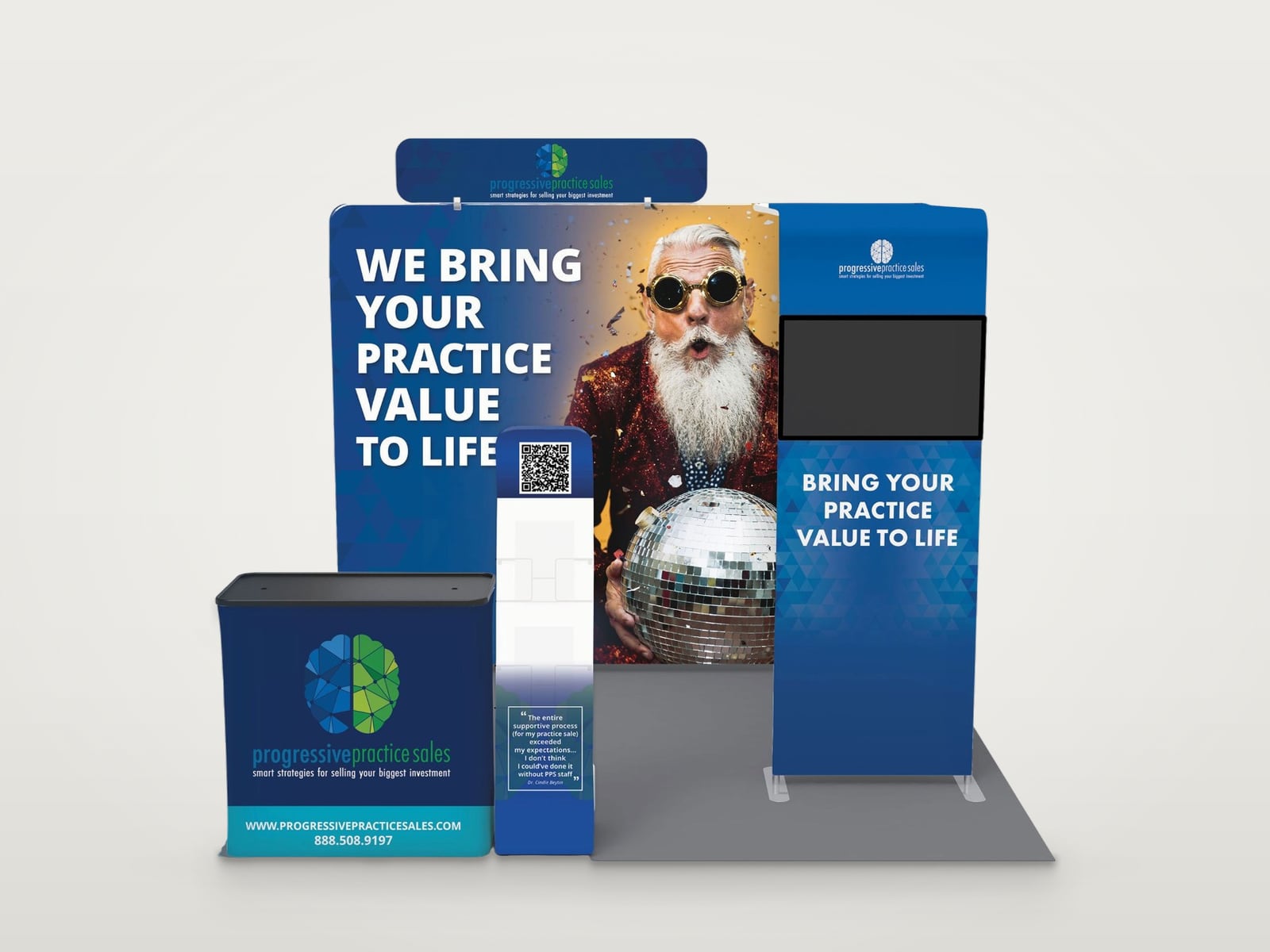
Real work: Progressive Practice Sales booth with one headline across the back wall, shown on a presentation mockup.
1. Too much text on the wall
A back wall is read in a few seconds from the aisle, not studied like a brochure. Long paragraphs, feature lists and small print get skipped. Fix: one headline that says what you do for the buyer, no more than three short supporting points, and everything else in handouts and the conversation. The backdrop article covers what to keep.
2. The logo sits where people stand
Logos and headlines placed low on the wall disappear as soon as staff or visitors stand in front of them. Fix: keep the logo and the main message high, above head height, and repeat the logo lower on the counter.
3. A message nobody understands
Clever slogans, internal product names and acronyms mean little to someone walking past. Fix: write the headline in the words your buyers use for their problem, and test it on someone outside the company.
4. A closed front
A table straight across the front of the booth, or furniture filling the space, makes visitors feel they need a reason to step in. Fix: keep the front open and put the counter to one side. The 10x10 layout ideas show layouts that stay inviting.
5. Every booth in the hall looks the same
Many booths in one industry use the same blues, greys and abstract lines. Fix: use your brand's most distinctive colour boldly, one strong visual and a headline in plain words, so the booth is remembered after the show.
6. No clear next step
Visitors who are interested still need to know what to do next. Fix: a QR code at eye level near the counter with a short reason to scan, and a lead form tested before the show opens.
7. Print problems found too late
Text or logos cut by panel seams or curved edges: design from the supplier's template and keep important content inside the safe area.
Photos that look soft at full size: check resolution at the printed size. The artwork size calculator helps.
Colours that do not match the brand: ask the printer for a proof of the colours that matter most.
Files sent at the last minute: work back from the printer's deadline with the design timeline.
8. Never seeing the booth before it is built
Flat artwork on a screen hides how walls, counters and towers work together in the space. Fix: preview the booth in 3D before printing. Booth Studio does this for free in the browser with your logo or finished panels.
Questions
Questions
What is the most common trade show booth design mistake?
Too much text. A back wall is read in a few seconds from the aisle, so one clear headline and a few short points work better than paragraphs or long feature lists.
Where should the logo go on a booth?
High on the back wall, above head height, so it stays visible when people stand in front. Repeating it on the counter helps visitors who are close.
How can I check a booth design before printing?
Preview it in 3D from the aisle, read the headline at a glance, check every panel against the supplier's template and ask the printer for a colour proof.
A week-by-week timeline for planning trade show booth graphics, from booking the space to show day, so the design is ready before the printer's deadline.
Practical trade show booth ideas for the back wall, the layout, small booths and lead capture, with what each idea is good for and how to test it first.