Roll-up banner design: what to put on a retractable banner so it works from across the room
A roll-up banner is tall, narrow and often the only graphic at a small stand or a conference table. It is read from a few steps away, often over people's heads, so the layout works from the top down and the bottom of the banner matters least.
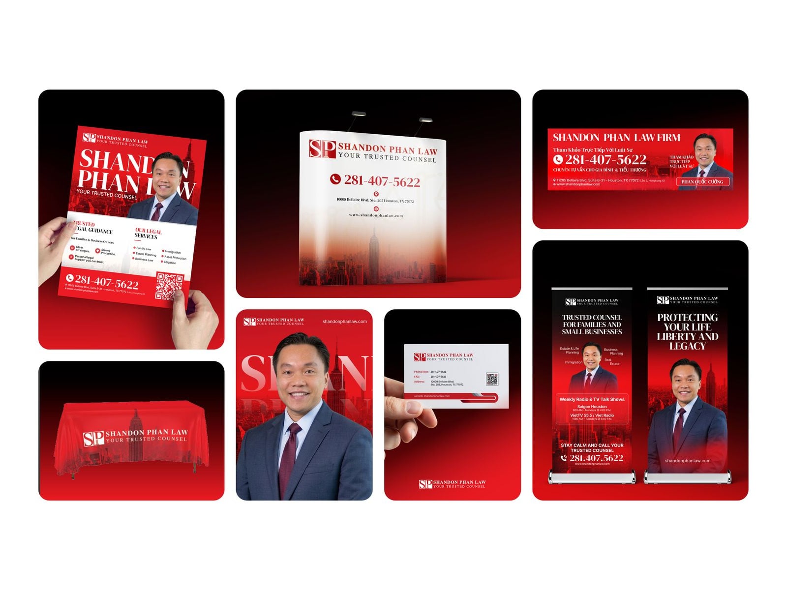
Real work: Shandon Phan Law event branding, including two roll-up banners, shown on presentation mockups.
Design from the top down
Logo at the very top, where it is seen over a crowd.
One headline that says what you do for the visitor, in large type.
One strong picture or product visual in the middle.
Two or three short points, if any.
Website, QR code or contact details at about chest height, where people can scan them.
Keep the bottom quiet
The lowest part of a roll-up is hidden by tables, chairs and people, and the last few centimetres usually roll into the base. Keep important words out of the bottom area and check the supplier's template for how much disappears into the cassette.
Text that reads from a distance
Use few words. A banner is a sign, not a brochure.
Choose a clear, heavy typeface for the headline and keep thin or script fonts for decoration only.
Keep strong contrast between text and background, and avoid text over busy photos.
Test it: print the design small, stand back and see what you can read in a few seconds.
Sizes and print files
Widths of about 80 to 100 cm with a height of about 200 cm are common, but sizes vary by supplier, so always design from the printer's template. Logos and text should be vector. Photos need enough resolution at the printed size; the artwork size calculator works out the numbers, and the artwork checklist covers bleed and file formats.
Make banners work as a set
Two or three roll-ups beside a backdrop or a table cover should look like one family: the same colours, logo position and type. A matching set makes a small stand look planned. See what to put on a backdrop for the larger piece.
Questions
Questions
What should go on a roll-up banner?
The logo at the top, one clear headline, one strong visual and the website or a QR code at chest height. Keep the bottom area free of important words, because it is often hidden.
What size is a roll-up banner?
Common sizes are around 80 to 100 cm wide and about 200 cm tall, but they vary by supplier. Always use the printer's template for exact sizes and bleed.
How much text should a roll-up banner have?
As little as possible: a headline and two or three short points at most. People read a banner in a few seconds from a few steps away.
A week-by-week timeline for planning trade show booth graphics, from booking the space to show day, so the design is ready before the printer's deadline.
Practical trade show booth ideas for the back wall, the layout, small booths and lead capture, with what each idea is good for and how to test it first.
Common trade show booth design mistakes: too much text, a logo hidden behind people, a closed front, unclear messages and print problems, with a fix for each.