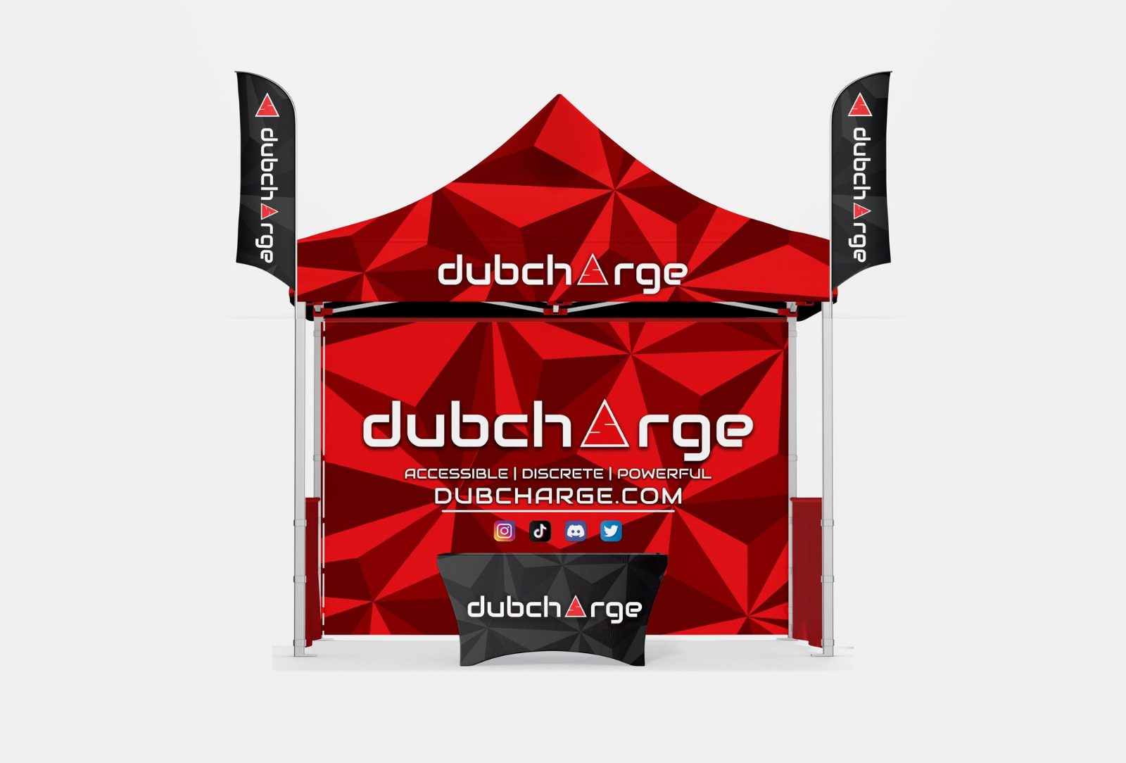
Event tent and feather flag design for outdoor shows and festivals
Outdoor events, festivals, races and field days are seen from much further away than an indoor booth. A branded tent and a pair of feather flags have to be recognised across a field, in bright sun, from every side, and still look like one brand up close.
Real work: a dubcharge event tent with back wall, table cover and two feather flags, shown on a presentation mockup.
Canopy valance: the logo, on every side
The strip around the top of the tent, the valance, is what people see first across a crowd, and from every direction. Put the logo or brand name on each side, large and on a plain background, so it reads even when the tent is seen at an angle.
Back wall: one line and one picture
The back wall is read when people walk towards the tent. Use one short line that says what you offer, the logo again and, if you like, one product picture. Keep text above table height, because the table and visitors hide the bottom of the wall.
Feather flags: tall, simple and readable
Flags are seen from far away and often move in the wind, so use the logo or one or two words at most.
Run the text along the length of the flag and keep it away from the curved top and the pole sleeve.
Strong contrast works best in daylight: dark on light or light on dark, not two similar colours.
A pair of flags on either side of the tent frames the stand and helps people find it again.
Colour that survives the sun
Outdoor fabric is printed with dye-sublimation, which gives bright colour but can shift strong or very dark tones. Ask the printer for a colour proof of key brand colours, and avoid fine detail and thin lines that fade in bright light.
Make the set feel like one brand
Tent, flags and table cover should share the same colours, logo and pattern, as the dubcharge set above does with its red faceted pattern and black accents. See table cover design and roll-up banner design for the other pieces, and the artwork checklist for print files.
Real examples1
REAL WORK
Real client designs by Sahariya, shown on presentation mockups. Open one to see it larger.
The logo on every side of the canopy valance, and one short line with the logo again on the back wall. Keep important text above table height.
What should go on a feather flag?
The logo or one or two words, running along the length of the flag, in strong contrast. Flags are seen from far away and move in the wind, so less is more.
Do outdoor event graphics need different files?
Usually the same vector logo and high-resolution images, set up on the printer's template for each tent size and flag shape. Ask for a colour proof, because fabric printing can shift strong colours.
A week-by-week timeline for planning trade show booth graphics, from booking the space to show day, so the design is ready before the printer's deadline.
Practical trade show booth ideas for the back wall, the layout, small booths and lead capture, with what each idea is good for and how to test it first.
Common trade show booth design mistakes: too much text, a logo hidden behind people, a closed front, unclear messages and print problems, with a fix for each.
How to design graphics for a trade show counter or promo podium: what goes on the front wrap, the header sign and the top, plus print and QR code tips.